Fur
Redesigning the furyou.com blog page for a simpler user experience.
UI/UX
Web Design
time frame
3 months
Role
Digital Designer
Responsibilities
Design Research, UI/UX Design, Information Architecture, Visual Design, Protoyping & Testing
01 ∙ overview
During my 3rd year at Parsons, I had the opportunity to intern at Fur, a skincare company, as a digital designer. At Fur, my main project was to help redesign their blog page on their website. Fur is an inclusive, vegan, cruelty free, non-toxic skincare brand aiming to bring comfort and care to all people.
Design question
How can we reorganize the blog landing page in order to increase viewership and enhance the overall experience?
What is the blog page?
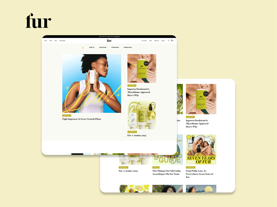
The Fur blog is a place where people can go to learn more about the products, read interviews with relevant people, and get connected to the brand as a whole.
Approach
My main approach was to create a system to organize the different types of blog posts by creating categories and tags.
02 ∙ process
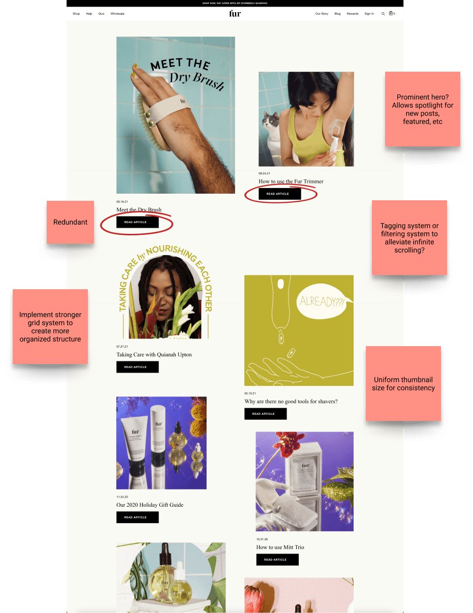
In order to effectively tackle the problem, I experimented with many different designs. Seeing how a prominent hero with categories underneath worked, or creating a tagging system to narrow down the blog posts shown at once.
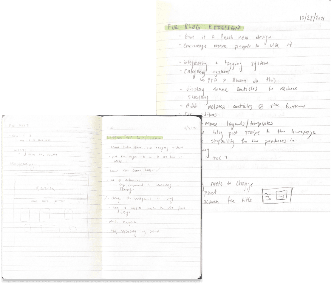
To begin, I sought out to figure out what is working and what is not on the blog page. I wanted to redesign the landing page in a way that still maintains the current identity, but improves the overall experience and look of the page.
wireframes
03 ∙ design
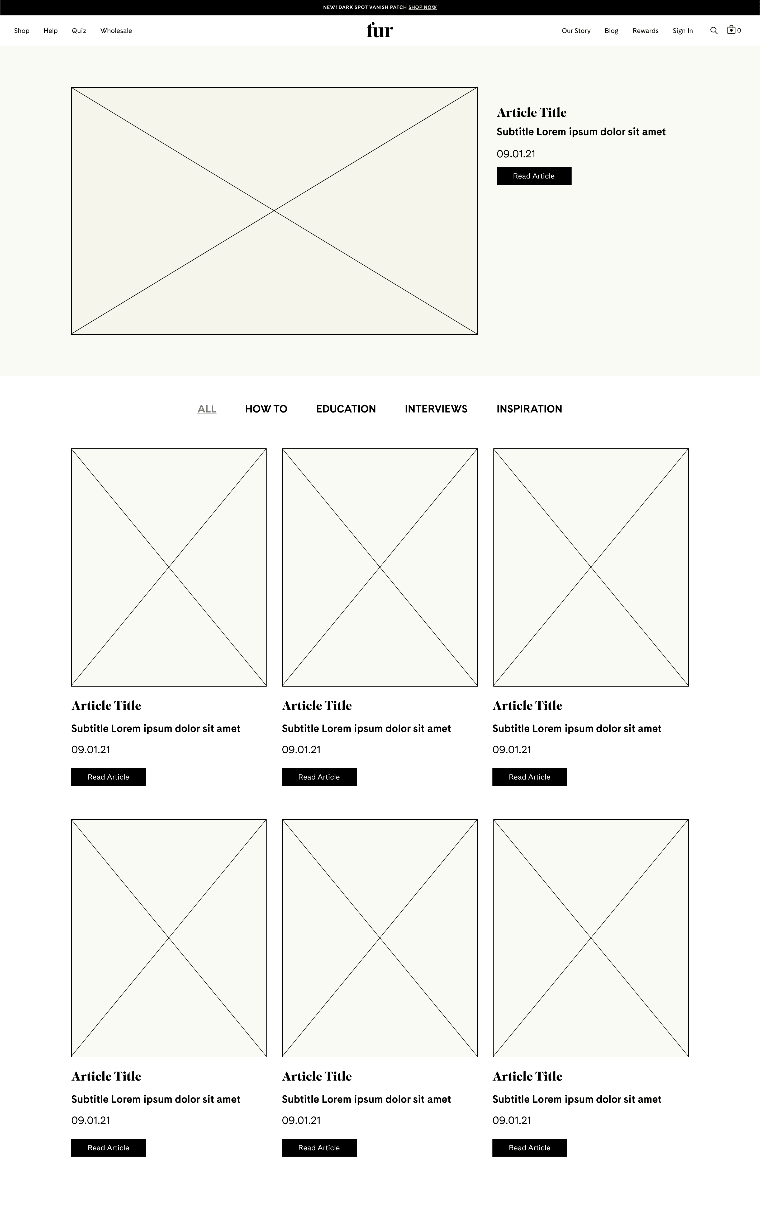
After extensive QA and iterations, we approached a final design that was easier to navigate, organized, and structured.
Prominent Hero
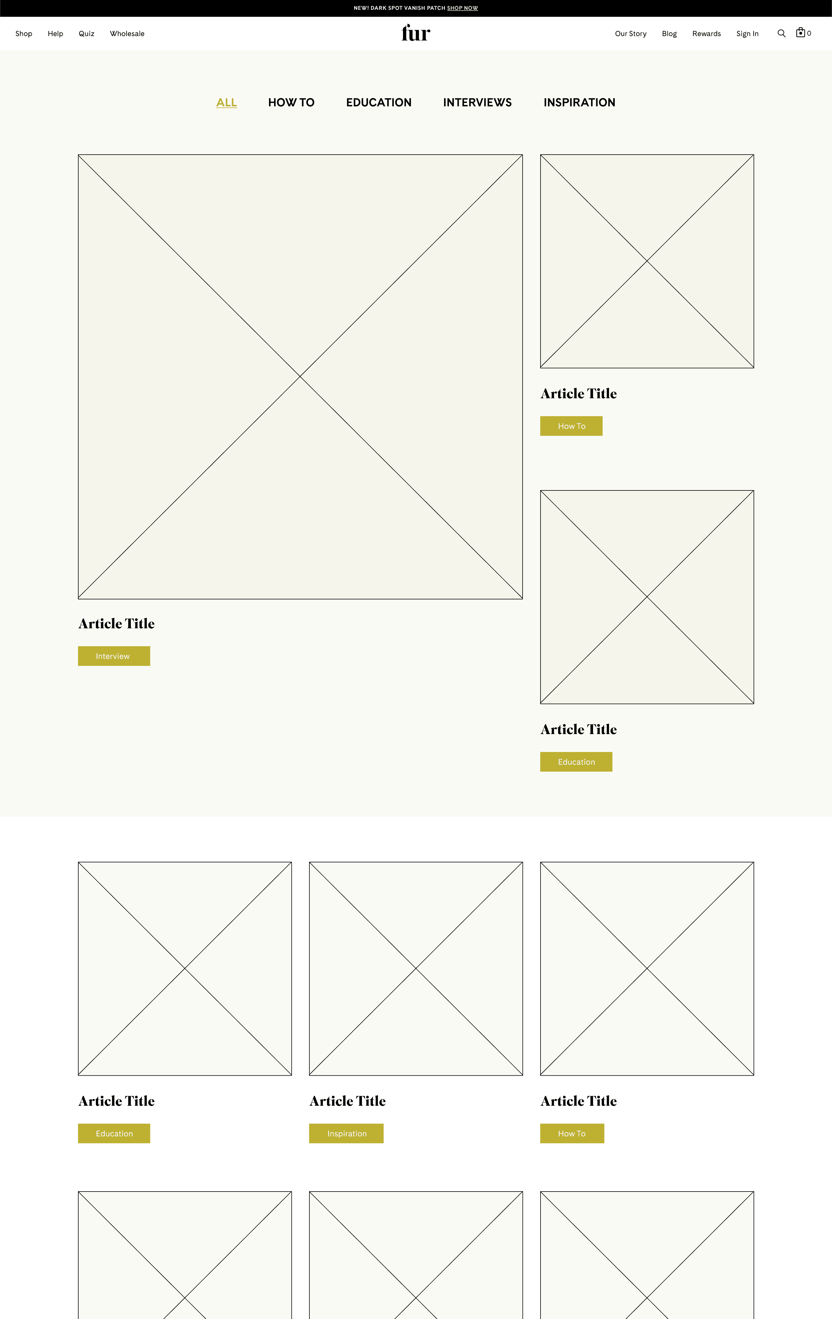
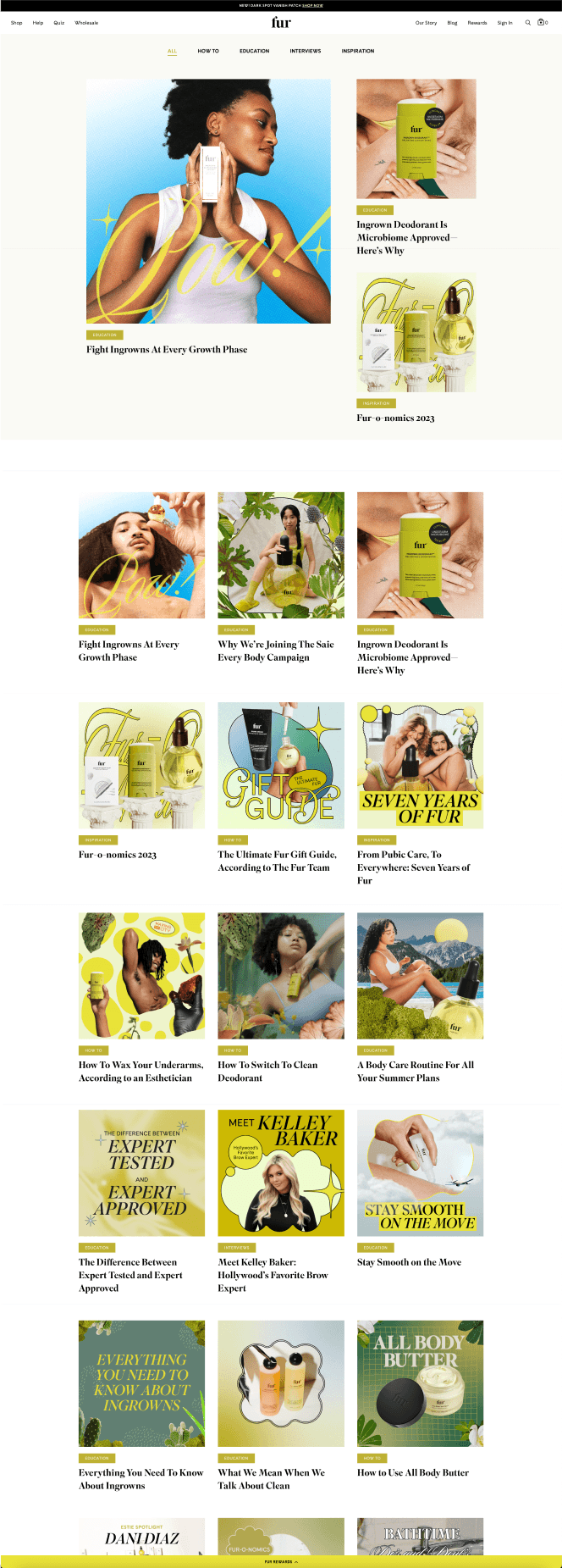
To provide an “at a glance” section, we created a hero that displayed 3 featured articles.
Categories
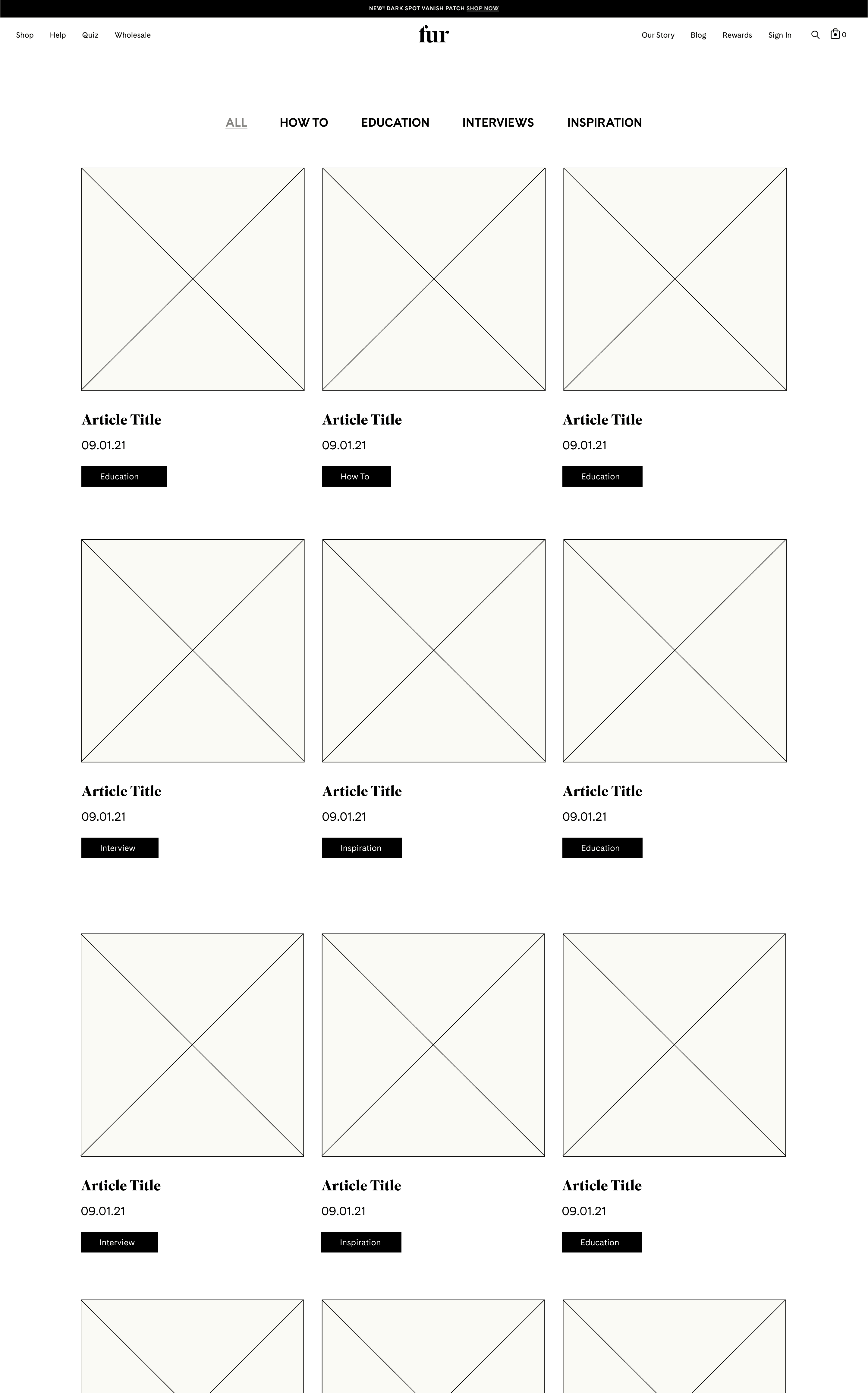
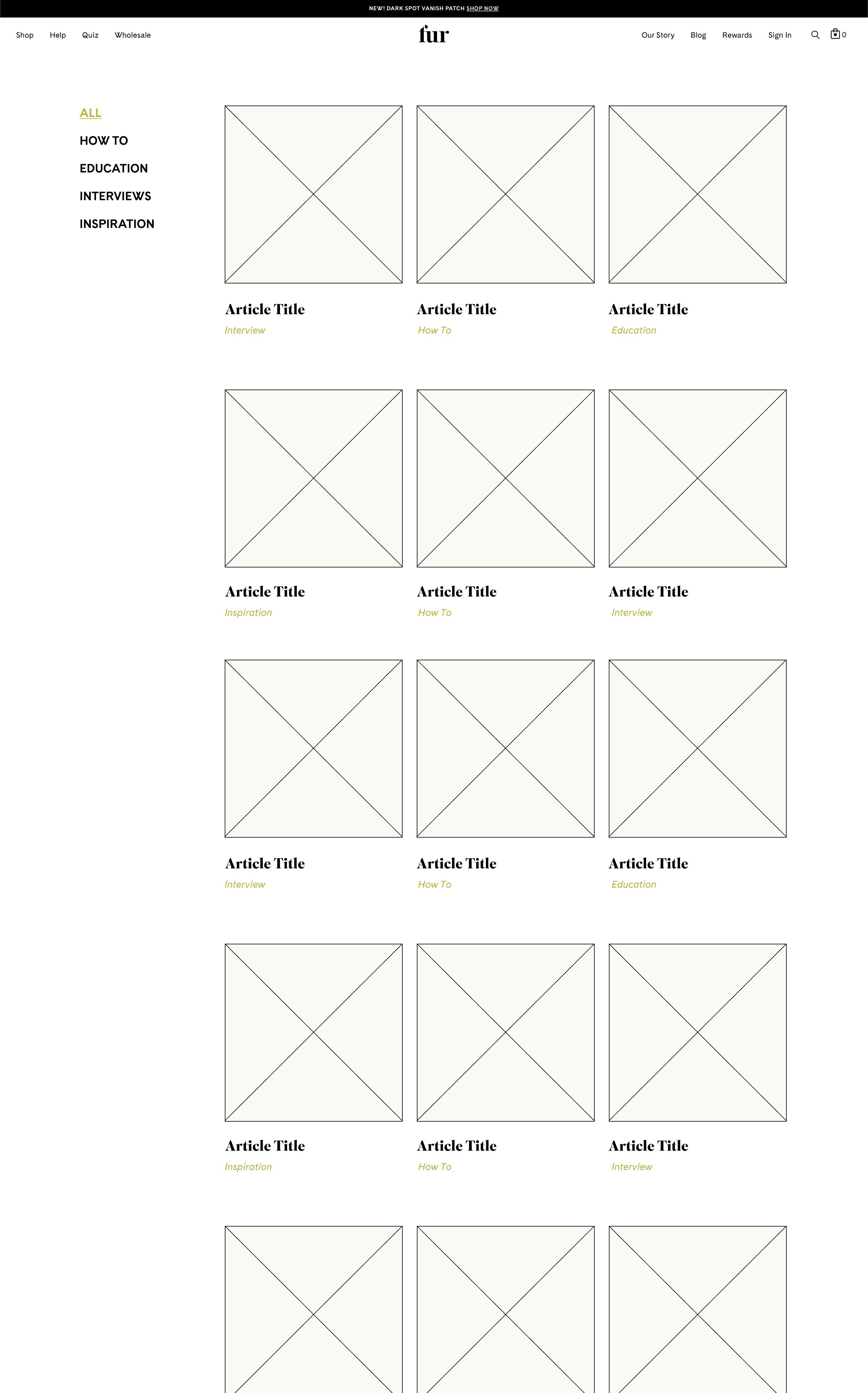
We created a menu bar with 5 main categories to quickly see the different types of blog posts. “How To,” “Education,” “Interviews,” “Inspiration,” and “All.”
Grid System
We simplified the layout from the former to utilize a 3-grid system with square image previews for each post.
Old Landing Page
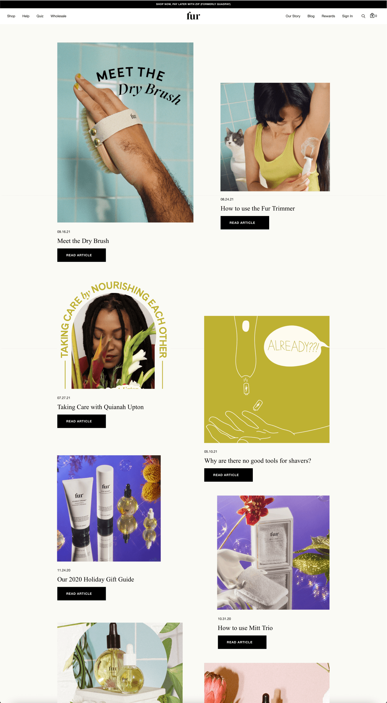
New Landing Page
Fur
Redesigning the furyou.com blog page for a simpler user experience.
UI/UX
Web Design
time frame
3 months
Role
Digital Designer
Responsibilities
Design Research, UI/UX Design, Information Architecture, Visual Design, Protoyping & Testing
01 ∙ overview
During my 3rd year at Parsons, I had the opportunity to intern at Fur, a skincare company, as a digital designer. At Fur, my main project was to help redesign their blog page on their website. Fur is an inclusive, vegan, cruelty free, non-toxic skincare brand aiming to bring comfort and care to all people.
Design question
How can we reorganize the blog landing page in order to increase viewership and enhance the overall experience?
What is the blog page?
The Fur blog is a place where people can go to learn more about the products, read interviews with relevant people, and get connected to the brand as a whole.
Approach
My main approach was to create a system to organize the different types of blog posts by creating categories and tags.
02 ∙ process
In order to effectively tackle the problem, I experimented with many different designs. Seeing how a prominent hero with categories underneath worked, or creating a tagging system to narrow down the blog posts shown at once.
To begin, I sought out to figure out what is working and what is not on the blog page. I wanted to redesign the landing page in a way that still maintains the current identity, but improves the overall experience and look of the page.
wireframes
03 ∙ design
After extensive QA and iterations, we approached a final design that was easier to navigate, organized, and structured.
Prominent Hero
To provide an “at a glance” section, we created a hero that displayed 3 featured articles.
Categories
We created a menu bar with 5 main categories to quickly see the different types of blog posts. “How To,” “Education,” “Interviews,” “Inspiration,” and “All.”
Grid System
We simplified the layout from the former to utilize a 3-grid system with square image previews for each post.
Old Landing Page
New Landing Page